Let me preface this piece by saying that I believe a number of the issues I had while playing this beta were due to my PC and not the game itself. While I wasn’t able to try it on a different machine and thus can’t back up that claim, it is my opinion with this specific title.
I was given the opportunity to try out a currently in development first person stealth horror game called Solarix. It’s only in the beta stage, but there’s already quite a bit to experience. Solarix is the first game to be developed by Pulsetense Games.
While stealth horror is not one of my favorite genres to play it’s one that I have much respect for because of the many great games that already exist in this category. This also means that Solarix has some big shoes to fill. When I think of horror games set in space, titles like Alien: Isolation and Dead Space come to mind. I believe that while Solarix, which again is only in beta form, doesn’t yet measure up to those games, it absolutely has the potential to rival them. Built with a mixture of elements derived from those games as well as other great games such as Portal, I see the final version of Pulsetense Games’ first title being something quite good. But currently it does have a number of issues.
[youtube link=”https://www.youtube.com/watch?v=eOZ4CLyUfEM” width=”590″ height=”315″]
GRAPHICS 
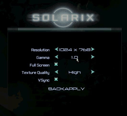
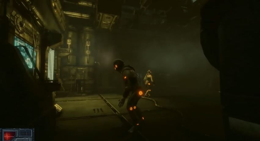
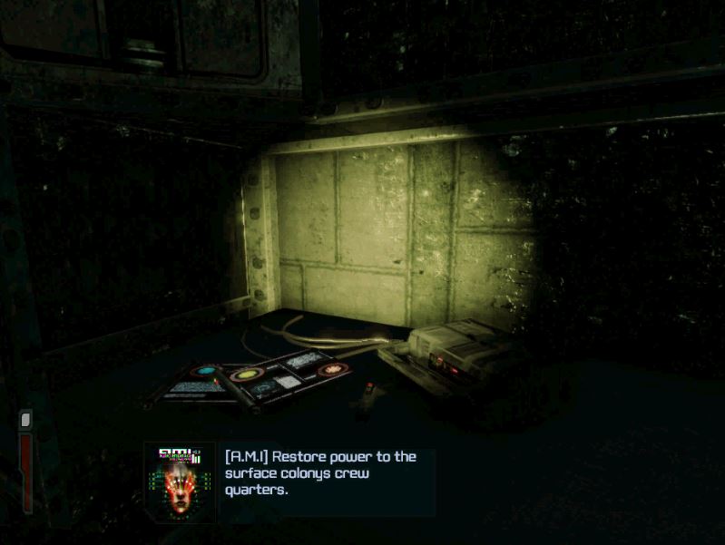
The graphics aren’t by any means perfect in Solarix, but I actually really like this about them. You have a number of resolution options and you can use windowed play, but you shouldn’t because the cursor issues make playing off full screen very difficult. There are a lot of finer details which really add to the atmosphere of the game. It’s not a series of simple areas on a single space station. You must travel between a surface colony and a rather large and varied station both full of several different connecting locations. But these locations are brought to life by the most minute things such as water spots on walls, rust on pipes, and more textures than you can count. Time plays a huge role in the graphics. This isn’t some space station that was just built. This is an old and long used world where things have already been deteriorating for quite some time.
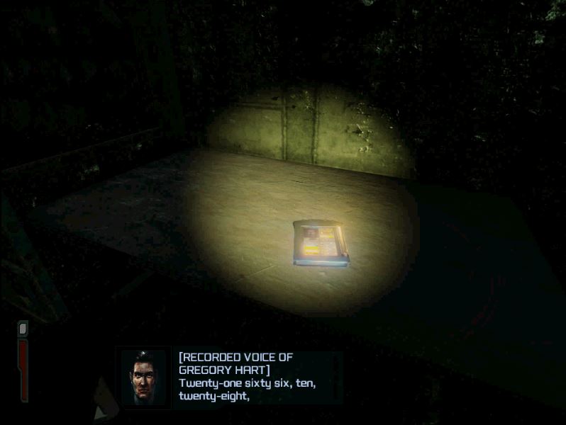
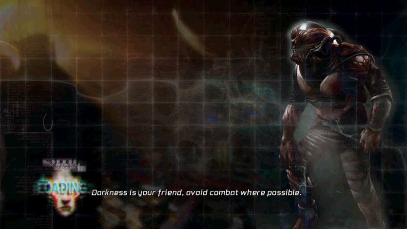
The horror aspect of the game is very well pronounced visually. For starters the game is very dark. This is not just to make the game scary. Light and shadow play an integral part in the game’s mechanics. Because it’s a stealth game the dark is your friend, and you must make use of it to complete the game. But at the same time the darkness is not inviting. It’s quite scary and you will be challenged if not forced to go where you would rather not. Light may seem helpful but it’s actually your enemy because it makes you visible to a host of different things that will try to kill you.
Enemies, of which there are a number of different types, look decent, but I wouldn’t say great. Your two main adversaries are robots that have gone rogue and infected humans that are essentially zombies at this point. Most of the infected are wearing space suits so they actually aren’t as scary or impressive as they could have been visually. The robots on the other hand come in a number of different and interesting forms.
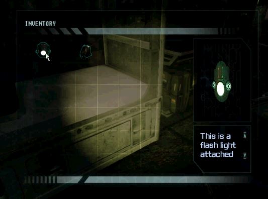
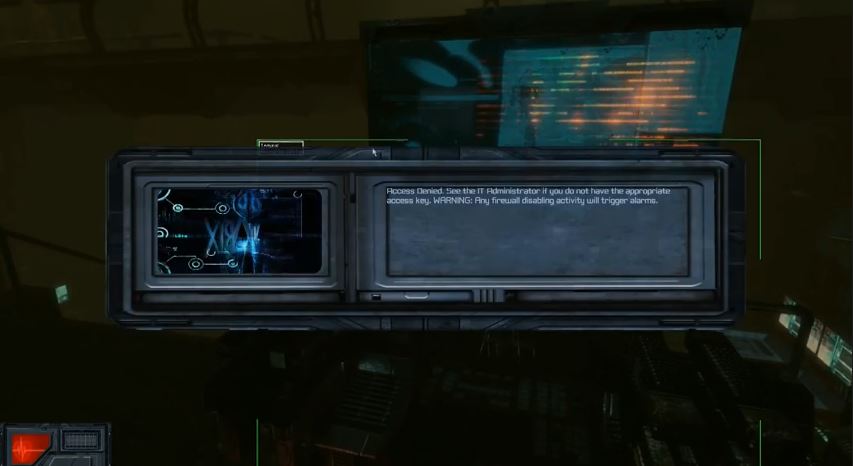
The menus work, but they don’t impress. Simple blue text over sold black backgrounds work fine for the overall feel of the game, but they come off a bit sparse considering how much detail went into the actual in game areas. I would say the same thing about the in-game windows such as the inventory and objective list. They both do the job, but they are quite disappointing when compared to the rest of the game. Especially the inventory screen. I think it’s absolute junk.
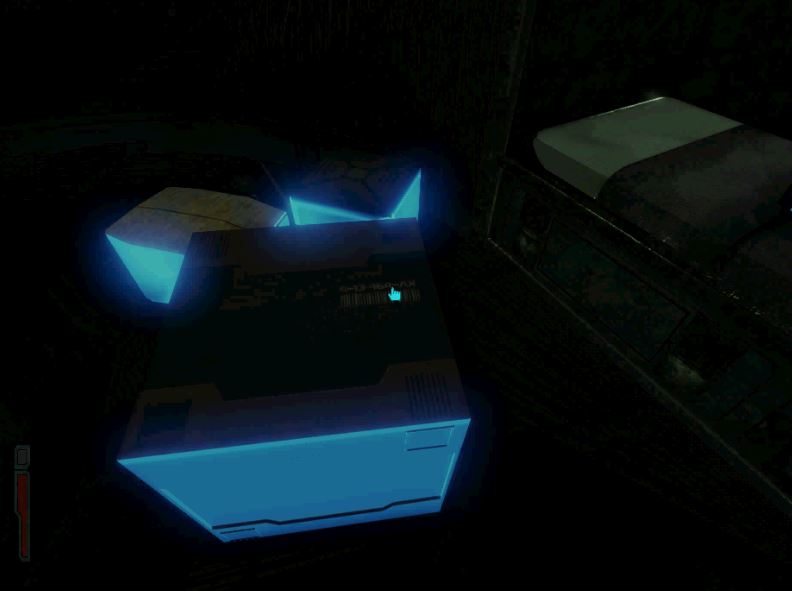
The game makes use of a number of colour based effects. Interactive items shine blue on and off for example. I felt that most of these effects looked very cheesy. They weren’t horrible, but they weren’t good either. I feel that a much better looking series of effects for identifying interactive items and using tools could be done. The high level of background details makes those things look like something done by a hobbyist in Adobe.
The best way to describe the graphics in my opinion is contradictory. A lot of really good backgrounds and items cheapened by lazy menus and interfaces mixed with lacklustre effects when actually using/interacting with items. The base is good but the top coat needs a lot of touching up.
GAMEPLAY 
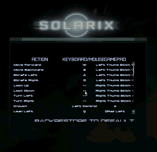
The short version of the gameplay is that it’s nothing new. Standard first person WASD and mouse controls with supposed gamepad support. I say supposed only because I couldn’t get it to work. Because of the number of other buttons you need to play this game I believe that gamepad is/will be the superior way to play in the final version. It looks like a PC game, but it wants to be driven like a console title.
There are 3 difficulty levels, with medium being noticeably more challenging than easy. You can be killed but you don’t have a straight life bar. It’s one of those games where if you take so much damage you die, which is made known by the screen flashing red and blood hitting the camera. You have access to a number of items such as guns, tools, and random usables like boxes. You play as an engineer and as such combat is not your main strength.
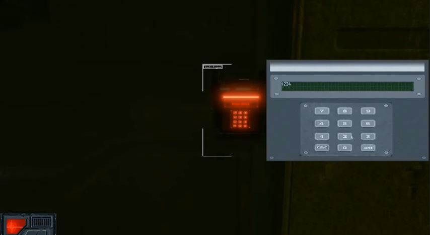
The game focuses much more on stealth and problem solving. You have to get from point A to point B with as little contact as possible. Often this requires solving puzzles, patiently sneaking around, and making use of special items such as key cards, hacking tools, and terminals that provide you with privileged information.
Light and shadow are gameplay elements. You have a brightness meter that tells you if enemies can see you or not. It tells you if you’re visible but it doesn’t tell you if you’ve already been spotted. You have guns, but often combat is not the best way to use them. Shooting out lights is a much more effective way to use your guns in Solarix. You will find that many enemies are extremely hard to kill head on, making stealth the much better method both for progressing forward and killing enemies.
My biggest complaint about the gameplay is the lack of a permanent cursor. The game definitely needs some sort of position identifier. A circle, an X, any kind of symbol that tracks the mouse will make a huge difference. This is especially true for windowed play. The position is never where you think it is which makes interacting with objects a nightmare. Keeping your helmet flashlight on does help a little but for a stealth game that really hurts. There is a cursor that appears when close to certain items, but that’s not enough for such a dark game.
I had a number of issues with item interactions. A big part of this was the cursor position problems, but also it seemed very laggy. It would take me several tries just to pick up stationary items and the floating-in-the-air-in-front-of-you graphics are not acceptable for 2015. I will say that I believe some of the interaction issues were my computer, but I generally had a lot of problems with actually doing things in the game other than walking around.
I really didn’t like the fact that you keep moving while in the inventory and other screens. Moving your mouse around your inventory should not also move the character, even if just his cursor position.
[quote_center]You won’t find anything particularly new here as far as gameplay.[/quote_center]
The gameplay is very reminiscent of other PC titles in the genre. You won’t find anything particularly new here. But it does work for what the game is meant to be. It needs tuning, but the general concept is solid.
SOUND 
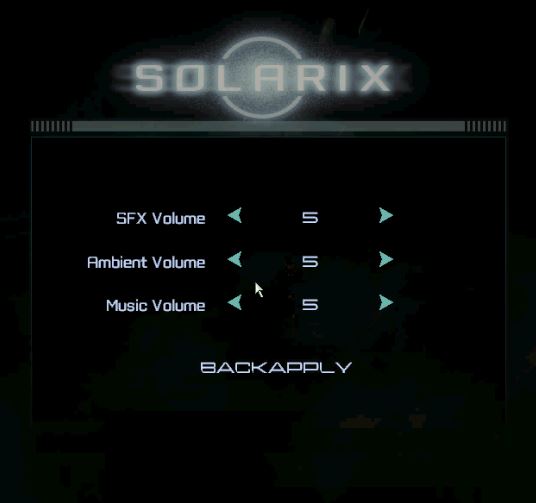
The sound quality is very good on all counts. I had a bit of scratchy background noise at one specific point, but it cleared up very quickly and I had no other issues. The ambient noise, music, and dialogue all play crystal clear. I would recommend raising them all from the default mid setting though because they are a bit low at that level.
The music and ambient noise is admittedly quite cliché. Lots of background creaks and screams from God knows where coupled with eerie music that isn’t necessary but creates the desired effect. It can actually be turned off separately if that’s not your thing.
I was really happy with the sound effects. No lag. Very clear and well chosen. Strong but not burdensome to the player. The game sounds the way it plays. The only issue I had was that the dialogue, which is always accompanied with in game subtitles, does not match up with the subtitles. That’s more of a graphics issue than a sound one because they sound just fine, but it was something I noticed that irritated me a bit. All in all the sound in general is very high quality from both a production and relevance standpoint.
WRITING 
The writing in Solarix is pretty solid for a beta. At this point there’s no opening sequence or anything substantial like that. I can’t even say how much if at all cutscenes will play a role in the final version. Currently the story is told mostly through found snippets of information and dialogue with a few characters.
As you progress through the game you will find a number of audio logs recounting events of the recent past and terminals with messages about any number of things. You also get direct dialogue from an administrative AI that comes off like GLaDOS and a seemingly crazy woman who can somehow directly contact you through your helmet.
The basic story appears to be that Solarix is a deep space exploration company that you work for as an engineer. The colony you’re working on was involved in some genetic testing gone wrong that led to the creation and spread of a virus that has killed most of the population or transformed survivors into monsters. At the same time, the robots on the station and colony have gone rogue leaving you as one of few survivors trying to stay alive and figure out what’s going on. Not the most original video game plot, but it does the job and justifies the horror.
I really like the way the story is told in the beta and I’d actually really like to see the whole game done with as few cutscenes as possible. The audio logs and messages make for a much more realistic experience because you are learning what’s going on with the character in the same way that he does.
REPLAY VALUE 
Because this is just a beta, I can’t say for sure if there will be any replay value other than difficulty level. There is likely multiple ways to get past certain points in the game, but at this point there’s no scoring or anything, and collectibles aren’t tracked. There might be some achievements but for now I can’t really say yay or nay on the replay value for Solarix.
CONCLUSION 
I’m excited to see how the final version of Solarix turns out. Based on what I’ve seen, the game is at a crossroads. Depending on how development progresses from this point it could end up being a phenomenal debut title for Pulsetense Games or it could just end up being a disappointment. I’m hoping for the former, but it wouldn’t be the first time a game looked great at announcement and then ended up crashing and burning. All I can say for now is keep an eye on this title if you like stealth horror.
Solarix is projected to be released in the earlier half of 2015. You can find out more about it on Steam.
