This week I got to try out the alpha for an upcoming indie game called Project S.P.H.E.R.E.. It’s being developed for both android and PC by a one man team known as Luux on IndieDB.
Project S.P.H.E.R.E. is a platformer where you control a ball through a number of different challenging levels that involve mostly jumping and avoiding spikes. I try to give slack to in-development games wherever I can, but I still have to be honest, and honestly I can’t say that I’m looking forward to this game based on what I’ve already seen. But I’m not infallible. Sometimes a game just doesn’t appeal to me but still might actually be a really good game. So with that, I will write this to the same level of care and thoroughness with which I write all my reviews and let you be the judge.
GRAPHICS 
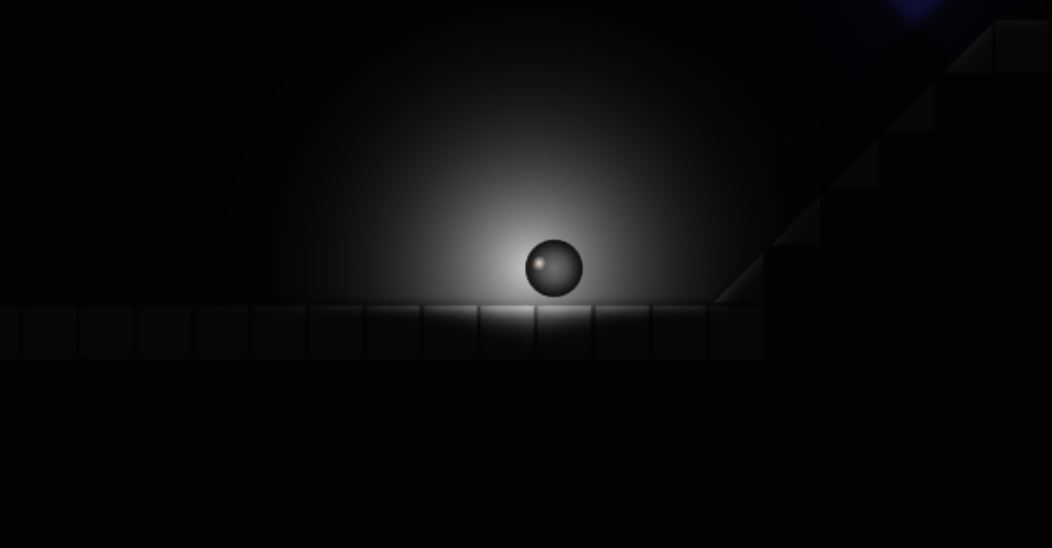
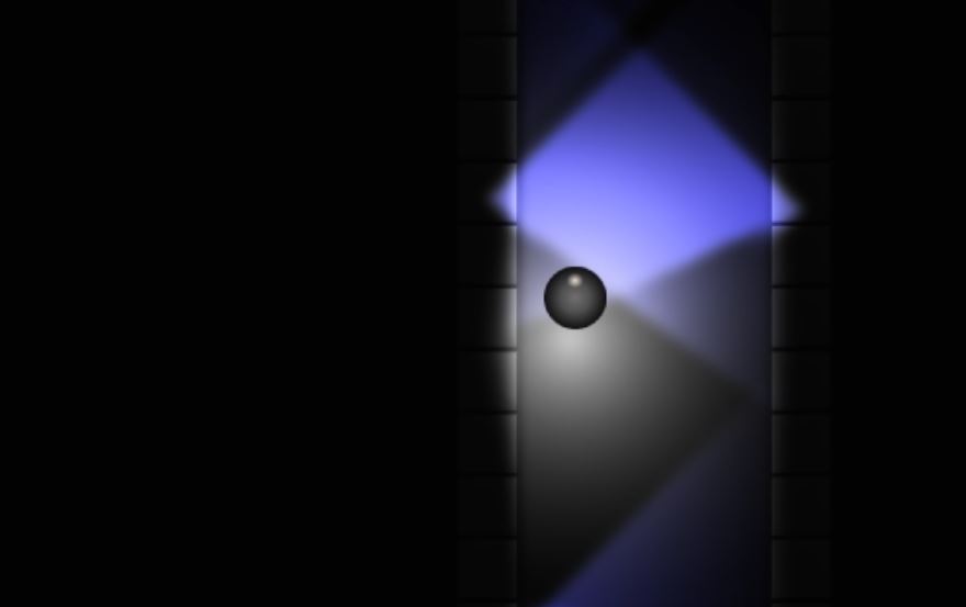
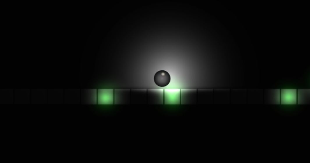
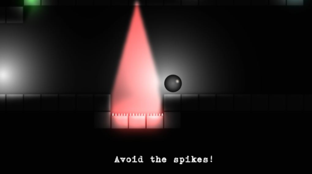
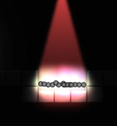
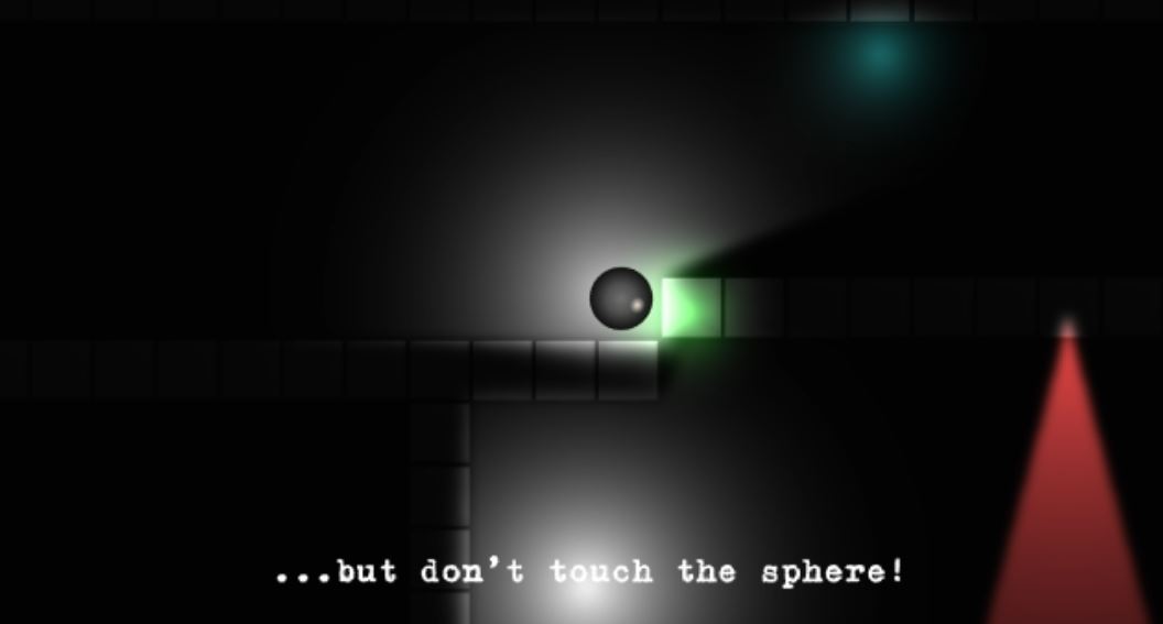
The graphics are very simple in this game. You play as a black ball in a world of simple platforms, spikes, smaller collectible balls, and a number of different colours of light. Later on in the game you also find magnets and a few other assorted objects. The atmosphere is intentionally dark, but personally I think it hurts the overall game. It definitely cuts down on development time when you don’t have to properly skin and lighten everything, but for the type of gameplay, which is intentionally very difficult, the darkness only irritates the player.
Darkness can be a very effective tool in games. Dead Space is a great example of this. But this is only the case when the experience is enhanced by the darkness. To simply use it to make a game more difficult is pointless and somewhat lazy. And in this case, completely unnecessary because the gameplay actually is challenging. I’d much rather see a different visual scheme in Project S.P.H.E.R.E.
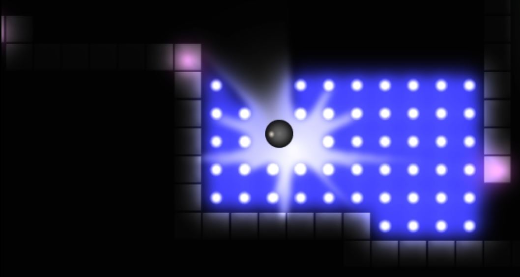
On the other hand, the lighting effects in this game are very good. I was very impressed by how light is used in the game. Luux did a great job with making light have a real presence even though there isn’t enough of it. This is mostly shown in how light interacts with the SPHERE you control. There are a number of different colours of light, but from what I’ve seen the colours are aesthetic and don’t actually have different effects.
A lot of the smaller visual aspects of the game still need work or at the very least some touch ups. The SPHERE doesn’t look good – it’s a flat ball with layers of lighter shades on top of it to give it the illusion of being 3-dimensional. Yes, that is what it really is and would be for all 2D games, but it looks too obvious here. It needs more gloss and a cleaner finish in order to really look like a sphere.
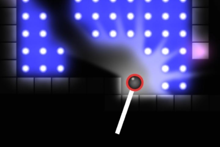
The fling effects just look lazy. The flat red circle that appears around the SPHERE only adds to the fact that it doesn’t look 3D. If anything it should just turn red or be fully covered in an opaque red haze when in fling mode. And the actual fling is literally just a white line that looks like it was created in MS Paint. No I am not exaggerating. There are no visual enhancements to it. It could have at least been an arrow.
I especially don’t like the text font. It tries to have a sort of spooky feel to it to go with the dark atmosphere, but it actually comes off as unprofessional. Like the difference between submitting something in writing versus typing it out. It just has a cheap feel to it. And the menus look awful at this point. The gameplay looks way cleaner than they do. All in all, the graphics need a lot of work for me to be happy with them. And I’m not saying that simple graphics are a bad thing mind you. I love the way The Impossible Game looks and if anything it’s simpler than this game is visually.
GAMEPLAY 
Let’s start off by saying this game comes off more as a mobile app than a PC gaming experience, but the controls are so difficult that I don’t see it being very manageable on a touch screen either, assuming a similar control scheme of course. The controls are simple, using only direction keys and the mouse for flinging, but they aren’t very convenient. I would actually prefer to play this on a gamepad with a joystick for control and a specific button to induce fling mode as opposed to actually having to click the SPHERE in order to fling.
The physics aren’t great. You can’t stop very well, and stopping is really just slowing down, because you are unable to actually just stop moving. It technically makes sense for a ball, but is really annoying for a platforming game. You can’t move to the degree that you should be able to, especially when in the air. And flinging isn’t done very well either.
To fling you have to collect blue balls called force orbs to gain flinging power, but the amount of power doesn’t quite work properly. The orbs give you force points which allow you to fling, but the amount of flings you can do is not tied to the number of orbs you’ve collected. It really depends on how hard you fling. As I’ve already stated, you have to click the SPHERE to fling and then you have to aim it by pulling back a bar which is equated to the amount of force the fling will have. Flings use force points and once you’re out of points you can’t fling anymore. But because the flings are tied to energy as opposed to number of flings, you often use up your flings before you reach your goal.
Luux expects too much from players for a game like this. Everybody over-flings and then you compensate with another fling. That’s just how gamers do it. The orbs should be tied to the amount of flings you can do regardless of how powerful they are, thus still keeping it challenging but making the system more manageable for the level of difficulty and quick decision making needed to complete this game.
[quote_center]You can’t stop very well and stopping is really just slowing down . . .[/quote_center]
When not flinging, the rest of the game is rolling and jumping in order to get over gaps and avoid spikes. Later in the game there are also magnets which affect your movement in a way that you would expect from a game like this. Throughout playing this I was really unhappy with the physics.
There’s a puzzle early on where you have to high jump which is done based on flubber style momentum when standing on certain unmarked platforms. You have to time your jumps in order to keep getting higher and higher. The problem is that the jump scheme is inconsistent. Sometimes you just hold down jump and you keep getting higher and other times you have to time it. A lot of the time you are being consistent, but the game doesn’t recognise it and you just can’t seem to make the height you need.
Early on I got stuck at such a place for about 20 minutes because my momentum just kept changing uncontrollably, never letting me actually reach the top. I ultimately rage quit and replayed it later, eventually getting through it. But it did not feel like I just wasn’t good enough. It was clearly a lack in the game’s physics build.
Project S.P.H.E.R.E. boasts itself as being extremely difficult and it is, but not for the right reasons. The number of flaws in the controls and physics, coupled with a bad flinging energy system in a world where you can’t actually see where you’re going half the time and have no real directional guide, makes the game extremely hard to beat. But not in the way that makes the challenge enjoyable and motivating. Even flappybird makes you feel like you have the ability to do it if you really concentrate. But that’s not how I felt here.
I often found the game was stupidly hard at times simply because it wasn’t made well. You should never feel like you can’t progress because you actually have no idea what you’re supposed to do or where you’re supposed to go. But this happens to you because you can’t see enough and the “hints” don’t really tell you about where to go. They basically just tell you how the controls kind of work and how that will be what you need to progress. It’s for this reason that I was unable to actually complete the alpha. I didn’t get to a point where I couldn’t rise to the challenge. I simply couldn’t progress any further because I just couldn’t see anywhere else to go with the limited mobility that you have.
Project S.P.H.E.R.E. has a number of flaws in the gameplay that can and hopefully will be fixed. There is a vast amount of room for improvement and a number of big changes that need to be made in order for this to be fun and entertaining as opposed to just annoying. The gameplay doesn’t get so difficult that you can’t take it any more. It gets so troublesome that you become irritated and ultimately bored.
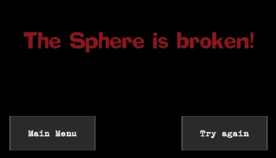
Since there aren’t points or anything at this point, you really don’t have anything to show for your efforts. And there needs to be an auto respawn feature when you die as opposed to having to go to another menu and clicking retry then having to reload the level. As far as gameplay goes I gotta say, send it back to the studio.
SOUND 
The sound quality in this game is ok. It’s not scratchy or broken in any way, but there are some major flaws. Whenever you jump or bounce there’s a sound for that, as there should be, but when you stop pressing anything after bouncing high the game does the several bounces sound effect that tries to simulate a ball clattering on the floor which is admittedly very hard to recreate for a game.
The problem is that there’s no actual sound for moving in the game so there tends to be only sounds for certain types of movement but not all types of movement. Luux should have just gone with sounds for intentional jumping as opposed to landing and not done the clattering sounds at all. Especially since you can’t ever actually stop moving in this game. Even when you try to stop, the SPHERE just keeps slowly rolling in its current direction, and yes unless you press pause you will eventually roll off the end of a platform if you don’t touch the controls.
My biggest problem with the sound effects is that there really aren’t enough of them. There’s no sound for dying or collecting orbs or any number of other things you would expect. There’s some light background stuff for effect, reminiscent of leaky pipes in a sewer level, but for the most part it’s a quiet game. There are actually more sounds in the restart menu when you die than in actual gameplay.
One thing I really didn’t like is when doing continuous really high jumps, you often hear a clicking sound. I have no problem with clicking sounds in games where they actually mean something such as in The Last of Us, but in this case the click, which doesn’t happen during every high jump/fall, didn’t seem to actually signify anything. It would happen as if my speakers were having problems or something.
As far as music goes, Project S.P.H.E.R.E. really disappointed me. Not because the music wasn’t good, because it actually is. And not because it’s inappropriate because I felt that it was very well chosen. My problem with it is that you can’t hear any music during the gameplay. There’s music during the menus and the trailer has a great soundtrack, but when actually playing the game you only get sound effects and no music. I’m just going to assume that won’t be the case in the final product because the music really adds to the dark atmosphere that Luux is going for.
WRITING 
At this point the writing is only used to give directions. It appears at the bottom of the screen during gameplay and usually in broken phrases instead of full sentences. There’s a forced air of suspense in the writing as if the game is trying to scare/intimidate you with phrases like ‘. . . and much more dangerous . . .’
Some of the directions are very obvious and some are much more subtle like ‘. . . but light can guide you . . .’ For the record, I’m not adding the ellipsis for effect. The text is basically always written in the game in single quotes with an ellipsis at the start and end of each phrase. The writing is definitely appropriate, albeit a little dramatic. This is just an alpha so I’m sure that will all get cleared up, but currently I wouldn’t give Project S.P.H.E.R.E. high marks for writing in either content or presentation. Though it’s not a plot based game, so that shouldn’t necessarily be why you do or don’t choose to play it.
REPLAY VALUE 
Currently the game has no real replay value. There aren’t any points, a gameplay clock, or any of the other things that motivate you to want to try again after beating it. It’s still in alpha so those things may be added over time, but between the flawed physics coupled with unnecessarily troublesome, definitely not gratifying puzzle type levels, I don’t really see myself wanting to replay Project S.P.H.E.R.E. after a first playthrough.
There are definitely a number of things that can and quite possibly will be added to the game such as achievements and best time records that will encourage another playthrough, but for now it has none and isn’t fun enough to want to play it again. There are a number of levels and because of how difficult the game appears to be, they will take you a while. I’m not sure what the price will be, so I can’t say whether or not it will be long enough to warrant a buy.
[quote_center]Currently the game has no real replay value.[/quote_center]
CONCLUSION 
In conclusion, I’m gonna have to say pass on Project S.P.H.E.R.E. based on what it currently is. It has a lot of potential, but even in its alpha form it has a number of serious issues that keep me from being able to endorse it. For a one man development team, it’s definitely something noteworthy and much better than anything I could do at this point, but when compared to other games of this type, it’s just not that good.
There’s not a lot of information currently available about Project S.P.H.E.R.E., but if you’re interested you can read a bit more about it on IndieDB or Desura.
